Rebranding a twenty-year old film production company, Shree Venkatesh Films with a new brandname and visual identity system- rebranded as SVF. They’re the largest integrated entertainment company in east India, and one of the largest in India:
Producers of 110+ films, largest film distributors, own 4000+ hours of TV content; 700 bengali songs; a TV channel, helped launch many top celebrities. The challenge was to rebrand SVF as a modern entertainment company, giving them the required image upgrade without putting off their viewers. For SVF to stay strong to it’s
cultural roots in Bengal, yet look global to reach out to a future global audience. We developed an identity, the strokes of which resemble characteristics of the Bengali script, with a diverse range of touch points that works cohesively as well as organically with
SVF’s vast variety of verticals.
SVF’s signature, a metaphorical sign of a commitment and an identity system in one. It implies a continued commitment to deliver dedication and passion in providing the best of entertainment. A visual system that is personal, emotional and human – just like their
cinema, music and television.
Monthly Archives: January 2018
Packaging, Work
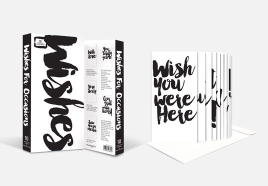
Box of emotions
First-of-its-kind greeting cards, set of 10 cards that could be used for any ocassion.
Occasions that are very important to people but would never strike you.
Packaging, Work
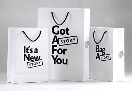
Brandname & identity for a bookstore chain
Three Calcutta bookstores took a brazen step. They left their franchisee-ship with the famous Crossword chain electing to build their own new brand. The stores would continue to operate at the same premises, but with a new brand name.
The ambitious owners are set to offer the best bookstore experience in the country: a pilgrimage for book-lovers. A real-world space where people would love to socialise. Somewhat of a tomorrow’s bookstore, but on ground.
First things first: we designed the brandname STORY. A bookstore is made up of stories. People connect with stories. Always have, always will. Its DNA is ageproof, adaptable and upgradeable.
We created an organic brandname and brandmark as our brand’s upfront story-telling tool. A social brand experience that provokes imagining and thinking. And, with a name like STORY, the design wrote itself.
Packaging, Work
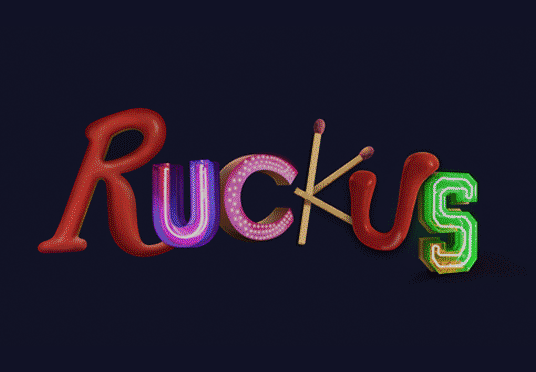
Packaging and Identity for an energy drink
RUCKUS is a new brand of an energy drink. It bottles itself in a wacky can that has a eccentrically designed name on it. Made for a tribe of people who live between being wise hippies and and unwise professionals. And other offbeat ones like them.
Websites, Work
Tracktical
Websites, Work
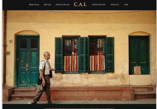
CAL

Websites, Work
ZERO

Websites, Work
Sagittarius
Webite design for a integrated public relations consulting firm.

Websites, Work
Brandname & identity for a bookstore chain
Three Calcutta bookstores took a brazen step. They left their franchisee-ship with the famous Crossword chain electing to build their own new brand. The stores would continue to operate at the same premises, but with a new brand name.
The ambitious owners are set to offer the best bookstore experience in the country: a pilgrimage for book-lovers. A real-world space where people would love to socialise. Somewhat of a tomorrow’s bookstore, but on ground.
First things first: we designed the brandname STORY. A bookstore is made up of stories. People connect with stories. Always have, always will. Its DNA is ageproof, adaptable and upgradeable.
We created an organic brandname and brandmark as our brand’s upfront story-telling tool. A social brand experience that provokes imagining and thinking. And, with a name like STORY, the design wrote itself.
Websites, Work
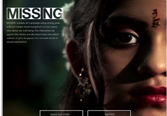
Website for a public campaign against women trafficking
A nationwide public movement and awareness against women trafficking. Over a million girl children are unaccounted for in the Indian population because they trafficked. They are missing!