Html validation heading
We live in an interesting time of growth and progress.
Change is the only constant.
In India too, change has been felt in the design industry.
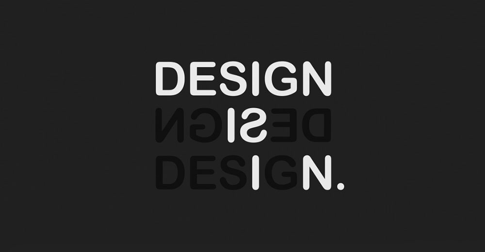
Design is the one of the only links between business and the society. “ It is a perfect response to bind people together and to elevate human life through harmonious synchronisation of needs and solution.”
Design caters to the special needs to all forms of society, be it impoverished or niche.
Design in India has come a long way, still relatively a smaller sector but its importance is being felt today. It has changed from being just a mere profession to being an instrument in the development of new business models. The focus of design in India has shifted from being a mere function of aesthetics to becoming a strategic process. The Indian design industry in maturing today, regardless of its small size, it has been seen to make an impact in the economy and various businesses.
In India it is easy to communicate to those who reside in urban cities as they are influenced both by the urban west and other developing countries. What is more important is to communicate to the impoverished village dwellers, and slowly the design industry in India has tried touching their lives in the villages as well.
According to the commerce and Industry Minister, Govt of India has a need for about 10,000 designers in India, and at present India has just about 1000 design graduates, meaning that we have only two designers for every millionth person in India as opposed to Finland with 120 and Japan at 90.
In this light the government of India has stressed that the design industry shift its focus to two and three tier cities to encourage the growth of designers and to have these cities be the driving force and backbone of design in India, and the future of Indian economy.
With more and more corporates in India, an ever-increasing economy and as the modern Indian becomes more affluent, consumers too look for well designed products and services, the scope for design in India has increased in two and three tier cities in India.
Indians today are well traveled, with an exposure to global design and minimalism has slowly crept into design. One of the most recognisable changes in design is the shift in focus to minimalistic designs. As Ashwini Deshpande, co-founder of Indian design and branding studio Elephant says, “There is so much being consumed in the form of words, pictures and sound, that there is a fatigue towards excess. We have also seen a significant change in path to purchase, as Indians are equally comfortable in buying from corner shops or modern retail or online. This, combined with the increased awareness of what’s really good for them, consumers prefer brands that cut to the chase and come across as honest and approachable.” This is because designers themselves over the past few years have decided to shift towards more simplistic avant-garde techniques.
While minimalism might be felt in product design, there is also a direct shift in design where it comes to focus towards women empowerment in design.
Advertisements are meant to to sell.
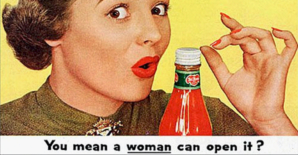
For long women have been crassly objectified in ads.
Their body parts showcased like pieces to sell.
The industry, however has evolved.
These days,the damsel in distress is the opposite of the strategies used by ad’s.
In India, too.
Here are some advertisements that are truly inspiring in their ideas and concepts:
https://www.youtube.com/watch?v=3kFRr06pa8o – The Nirma Washing Soap ad: Four women do something that no one else dares to. They see an ambulance stuck on the road they take charge. Together they manage to get the ambulance out of the pothole.
https://www.youtube.com/watch?v=yqorn7q3cz4 – Dove, Lets break the rules of Beauty: It is about changing the concept of beauty and realising that everyone is beautiful in their own way. There are no rules to beauty, it is about realising and accepting yourself.
https://www.youtube.com/watch?v=Ef27m5ocK6Q –Myntra: It is about changing the society’s concept of acceptable love. Two girls, who choose an alternative lifestyle. They are Bold and Beautiful.
India seems to be the boiling pot of some of the funniest and best TV commercials of all time.
People remember ads, if it appeals to their psyche. And ads do bias decisions.
Commercials need to have a wow factor to be remembered.
A lot of ads in Indian ads have aced this.
1. The Flipkart #BigBillionSale ads, where they depict children talking in adult voices.
Particularly the one depicting Mishra who says that he would like a
raise so as to buy a designer handbag for his wife. His boss then tells him its not how much money you make but what you make of your money.
He tells him to buy on Flipkart where the offer of buying a lot with a little is making rounds.This ad has a humorous appeal to the human mind and makes us laugh,
when we see all the children dressed up as typical adults in offices in India.
https://www.youtube.com/watch?v=Ao86jyKEZEE
2. Another good commercial is #StayStarted with Nescafe,
RJ Rishi’s Story. The copy of the commercial is good
as it registers in the mind and keeps coming back.
No Tring trong he goes, which really sticks. A good element in the commercial is the fact that the direction of the ad holds true to the product, Nescafe being sold to the audience. His airtime is in the wee hours of the morning which shows that he needs his Nescafe and that he is as stubborn as his coffee.This ad also has an emotional appeal as we initially feel bad for RJ Rishi. https://www.youtube.com/watch?v=0tBqrioLag4
3. The Amul Inner-wear ad is another one that has good direction and design. It doesn’t harbour any vulgarity even though it is an underwear ad. It is not typically flashy like normal underwear ads are. It focuses more on humour, where the girl keeps trying to gaze at a man doing yoga on his rooftop and finally she falls off while trying to view him and gets caught doing so. https://www.youtube.com/watch?v=FjOGoYlBkg8
4. Amazon ads have been doing well too.
They appeal to the Indian culture and are informative about the same. The #DeliverTheLove this Raksha Bandhan, depicts an elderly man talk about a smile. The end campaign is that Amazon will deliver the gifts but its the audiences responsibilty to deliver the love. https://www.youtube.com/watch?v=Wo6BkRgvYF8
Or even Amazon’s #MomBeAGirlAgain series of ads, are really informative on culture. They show the love and respect that mothers receive in India, and how a woman is appreciated.
https://www.youtube.com/watch?v=G_AujW2-8VI
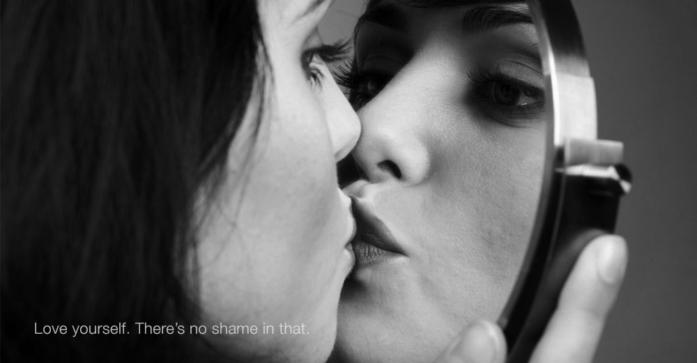
Whoever said this, probably never had to face the trauma of body shaming. Shame on Body shame!
Most magazines and ads are constantly selling us images of perfectly photoshopped women, making us think that we are not good enough the way we are, offering tips and soliciting advice as to how we should look, and society has accepted this to be the norm. Society has accepted that we should all be a certain size, have a certain hair type, height and weight.
A society that feeds on the insecurities of people, makes advertisements feed on these insecurities too. Society sets up standards of beauty due to what media has imprinted on our minds. Media subtly plays into our everyday lives and passes on a certain message that we should all appear a certain way or else we are ugly. Anybody not confirming to current norms of beauty need to change themselves according to what the media wants us to believe.
The media sells things to us just so they can gain. They ask us if our bodies are bikini ready, and if not they sell us such and such shakes, so that we can lose weight for that perfect summer body.
Fair complexions don’t imply beauty. Dark skin doesn’t mean unattractiveness. Skin tones don’t matter. Beauty comes from within.The need for surgical enhancement is unnecessary.
Age is just a number , a number that should be embraced and not shied away from. Preventing the inevitable is impossible. Ageing gracefully is more attractive than being embarassed about it. Wrinkles and spots are signs of experiences of life.
False advertising has lead to a host of problems in our society. Low self esteem has crept in due to constant bombardment of these messages.There will always be things people want to change about themselves, but it should never be because of a feeling of inferiority in comparison to another.
The investment world sees the value of Design in technology,
wants to understand its making from a “nice to have competency
to a need to have competency.”
This means that though previously design was
only a subsidiary part of technology, today it has
become a necessity, in technology, since products have to feel better.
This is the new way of thinking.
Today’s focus is on the simplicity of things.
Design is about relevance.
It is not just, about making a product aesthetically
pleasing but about making it an effective idea or concept.
Design makes this desirable.
Previously in order to make products cheaper,
tech companies would design at the end.
Today it’s the reverse. Design is seen as an investment,
it is added at the very beginning of a product manufacturing process.
Design has to work together with technology.
Apple is the only company in the world to have a Senior Vice President in design.
General Motors, in 1950’s hired it’s first VP in design,
which lead to car acquisition to have a sharp rise
after he changed the car designs.
The benefits of Social media for businesses are plenty a dozen.
We all have known what a powerful tool social media can be,
It helps keep a businesses connected to its customers,
its future customers as well as competitors.
Social media drives traffic to a companies website
and makes the brand more visible.
It increases a brands visibility at a minimal cost,
and cuts marketing cost by nearly half.
We can help build you brand on social media.
We react almost instantly to news and politics.
Everybody does.
Apart form creative people.
They start thinking, imagining and creating stuff
when the news provokes their spare creative brain.
Their humour starts kicking in and the
internet gets filled with GIFs, memes, films.
Wonder why the media doesn’t take advantage of this.
If they do, then not enough.


The Gif stands for “Graphic interchange format “, or as some put it “great internet fun”.
It turns 29 this year and was pioneered by Steve Wichita,
while he was working for Compuserve, in June 1987.
At the heart of any Gif is fun and humour.
Though they may be of low resolution and quality,
require low bandwith, supporting only 256 colours,
and don’t support sound, with no start and stop features,
Gifs gained popularity due to their emotional connection with people.
Gifs are so widely spread that it is hard to ignore them.
To the layman, it appears as a relatively new innovation
but it has been around for quite sometime now.
From meeting controversy, for using a patented technique
to going viral on the internet, the gif has come a long way.
It was used for designing webpages,
in its earlier stages, as placeholders or banners for websites
One of the early gifs were those of spinning globe in the Mozilla browser.
They gained popularity in the 90’s, as it was
the only way to get animations on to sites and due to its low standards could be accessed through any browser.Then the changes started to happen, when people wanted to do better than just an animated dancing banana, that used to circle back in the day , to adding videos and photo’s to Gif’s. This brought on the “rebirth”of Gifs. People didn’t want to hit play and stop in video’s to gain humour, they would rather just see it play on its own, because you couldn’t miss the humour then.
Today, gifs are used as a reaction to anything that happens in the news, sports, advertising or just for fun.
Go make some!

If you take a stroll around our little office, you’d find
a strange kind of creative nest- a not so safe haven of ideas.
We have some heavily booked walls.
We love quirky things. Quirky could easily be misunderstood as weird.
Feel free to drop by and interact with our designers
and other creative people, who aren’t designers.
Visit!

