Html validation heading
“If you just communicate you can get by.
But if you communicate skilfully, you can work miracles.”
Get your animation, youtube or ad films
within TWO WEEKS or LESS.
We’re not bad communicators.
How inspiring can an Instagram page get?
How innovative?
Is your Instagram page fun?
What about the other social pages?
Does you brand speak well?
Do people feel like they are missing out if they don’t follow your brand?
Few simple checkpoints.
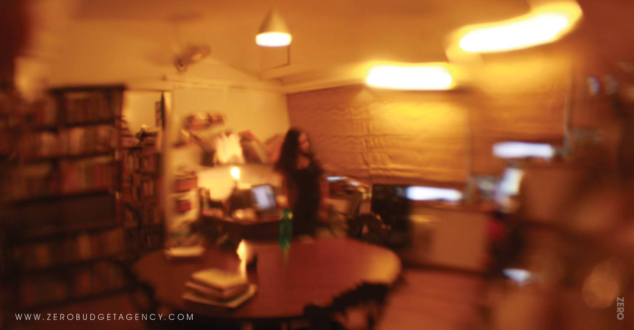
This is our design space.
Messy, yet organised.
Seemingly different.
We don’t like the ordinary, and our
workspace seems to have learnt that attitude.
Our team of talented, fresh professionals think of
original game plans to design your brand.
Don’t copy or steal when you can be real.
People always think the two to be the same.
A logo may be the first point of communication
between an organisation and its customers.
But, it is not the brand itself.
It is usually a cooler sounding name
for a symbol that acts as a face of the company.
Or a series of symbols – who wants a static logo these days?
A logo doesn’t always have to be
a literal representation of the company.
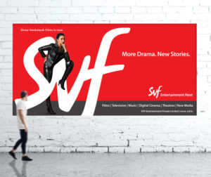
A film company doesn’t need to have a camera as a logo.
What’s important is
that the logo connects with your customers,
it is simple, easy, sticks to the mind,
it’s like-able,
maybe causes some disturbance.
What is also important is that
that your logo is not boring.
Remember it goes everywhere your business goes.
Take care to get a good one.
It certainly is for us.
Some people find our workspace crazy.
Or strange.
Some people love it.
There’s so much creative energy.
And lots of interesting things lying around.
Like a museum of strange things.
Drop by!
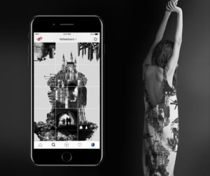
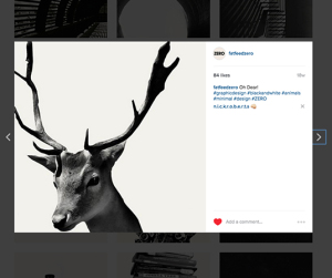
This is an experimental piece from
our very fat Instagram @fatfeedzero.
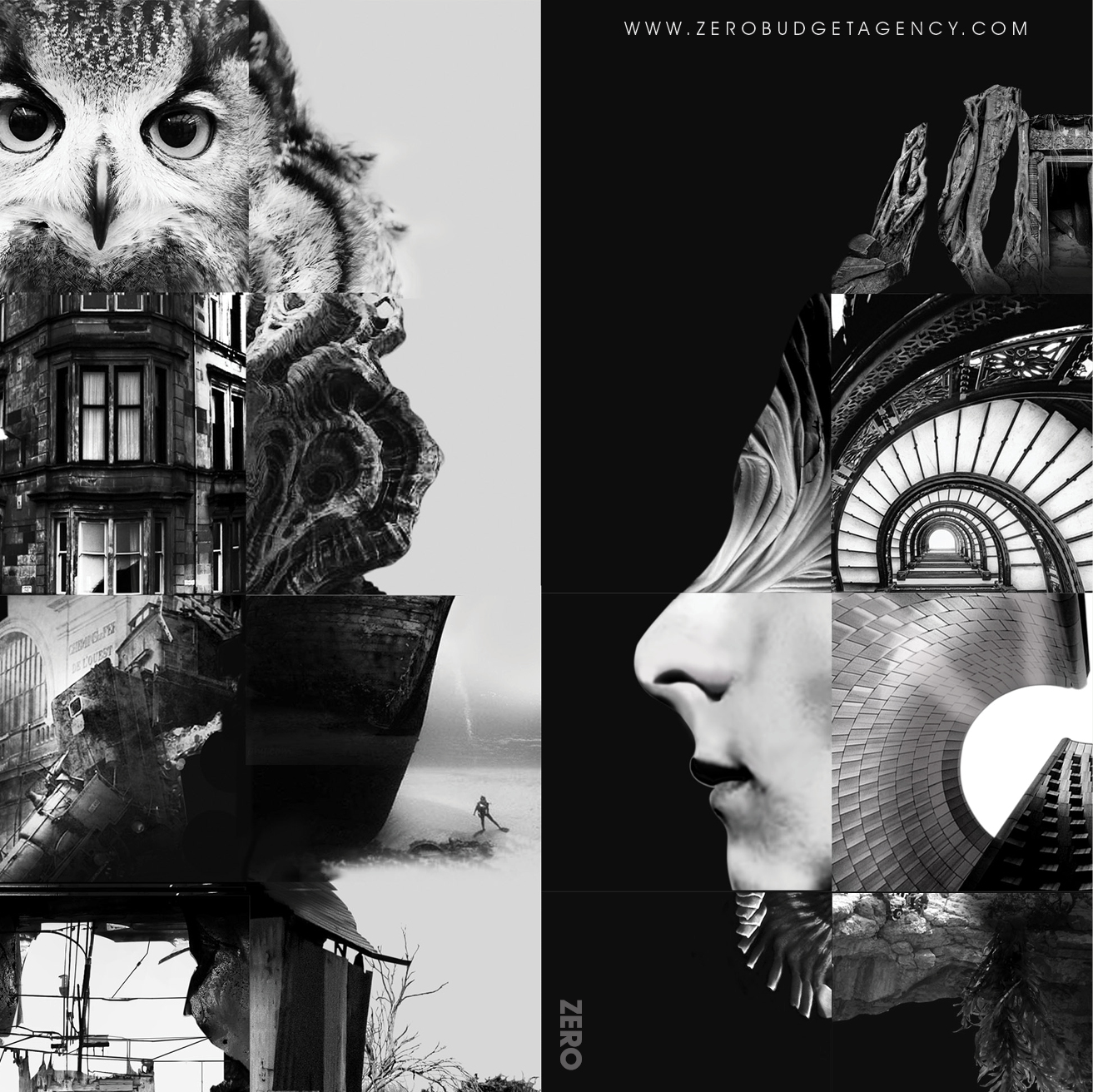
Our feed is a series of images that connect to
one another to form an overgrowing image.
Off late, our team has been obsessing over
Game of Thrones. And now that
is expressing itself in our Insta feed,
which our team curates very passionately.
Check it out sometime.
Instagram: @fatfeedzero.
Not ALL, but certainly a lot is in the packaging.
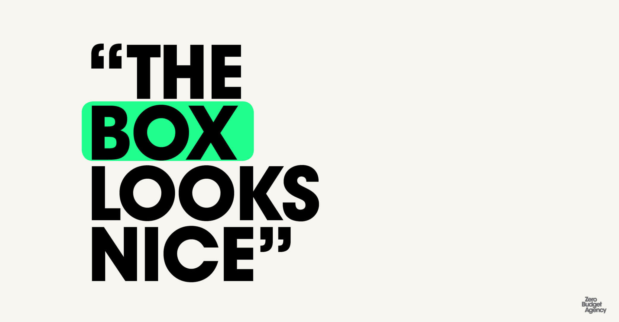
We’ve all been guilty of buying things because the box looks nice.
The box is what you see of a product, before you decided buy the product.
The box implies:
The little details on the box;
How the box looks on your website;
What the box says;
What it feels like;
How like-able it is;
Assuming your product comes in a box, that is.
If it doesn’t, it’s even more important to design its packaging well.
It could be an idea that you need to package;
A policy;
A person;
Your brand;
You.
Good packaging is a simple way to gain some competitive edge.
And complicated in the details that need to work seamlessly for a
packaging to be attractive.
Consider these simple factors when you’re
looking to design packaging for your products.
1. Brand Identity: Is it reflecting your brand effectively?
2. Visibility: The human mind and eye innately
have the capacity to differentiate between ordinary and different.
3. Information: Does it say the right things.
4. Protection: And for all practical reasons,
Packaging is what saves a product from wear and tear in handling.
It matters, a lot how a particular product lands on a consumer’s lap
and this impacts consumer perception of the brand.
In the end, packaging is a major reason that helps
a person decide to buy or not, giving it a competitive advantage.
Our Instagram feed is being fed almost every day.
And getting fatter than ever.
It is a graphic series of images
that connect to the next to make
a larger and ever-growing feed.
Check us out @fatfeedzero
Followers revisit us frequently, you may too.
Stretch your legs, or cross them,
Listen to jazz or punk.
Wear some clothes, or not.
Nobody cares!
Our workspace is fun, quirky, maybe a little weird.
It is certainly not ordinary.
This is where our creative process begins.
This is how our creative process begins –
from the energy in our room, with our people,
our strange corners filled with stuff we’ve been hoarding,
and book-filled walls, posters and fliers strewn around,
with little room to breathe.

